CRYSTAL
ZHU
Graphic designer. Creative explorer.
Helping you to tell your story
through striking visuals.
I'm Crystal, a Brisbane-based graphic designer with a passion for colour and typography.
My experience includes branding, events, corporate identity, wayfinding, digital marketing, editorial and packaging design.
I love exploring new techniques and the challenge of finding creative solutions.
crystalzhu.design@gmail.com
BRANDING.
EDITORIAL.
TYPOGRAPHY.
EVENTS.
BRANDING. EDITORIAL. TYPOGRAPHY. EVENTS.
tiny dust.a film photography zine

Tiny Dust: A commonly used phrase in Japanese eBay listings when describing the condition of a vintage camera lens. E.g. Optical quality: Tiny dusts. No effect in shooting.
This series of three zines is a love letter to my passion outside of work - film photography.
It tells the story of three different film photographers and their personal experience with the medium, and showcases my skills in branding and publication design.

I was inspired by the minimalist style of vintage camera manuals and advertisements from the 1970s, featuring clean lines, soft gradients and colour blocking.
I paired this with Capsule, a bold, curvy, reverse-contrast font, a reference to the midcentury space age aesthetic – a bridge between old and new.


Each zine focuses on a different photographer, and serves as a platform for creators to present their work and have their voice be heard, an important value to me as a designer.
Want to get involved? I’d love to collaborate for future issues!
bachelor of acting yearbook.As part of my coursework at QCAD, I participated in over 200 hours of placement at the Liveworm Studio in South Bank.
I thoroughly enjoyed my time there, working on a wide variety of projects, trying out different visual styles, all while gaining valuable experience of working in a studio environment.
I was honoured to have my design chosen for the Queensland Conservatorium Bachelor of Acting Yearbook 2025, celebrating this year’s graduates with a vibrant, youthful design to reflect their bright futures ahead.
QUEENSLAND CONSERVATORIUM

The cut out graphics reference the pop art movement, which emerged from the dominance of cinema and Hollywood in the 20th century, while the eyes and mouth represent the key tools of expression in acting.
When designing the internal pages, my mission was to combine the bold visual style with each student’s CV, ensuring the colours did not overpower the information, allowing the student to take centre stage.
By reducing each spread to three colours, it creates a streamlined feel while retaining the fun personality of the cover.

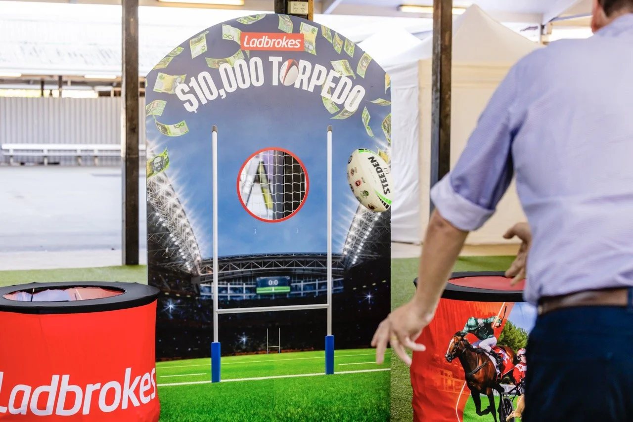
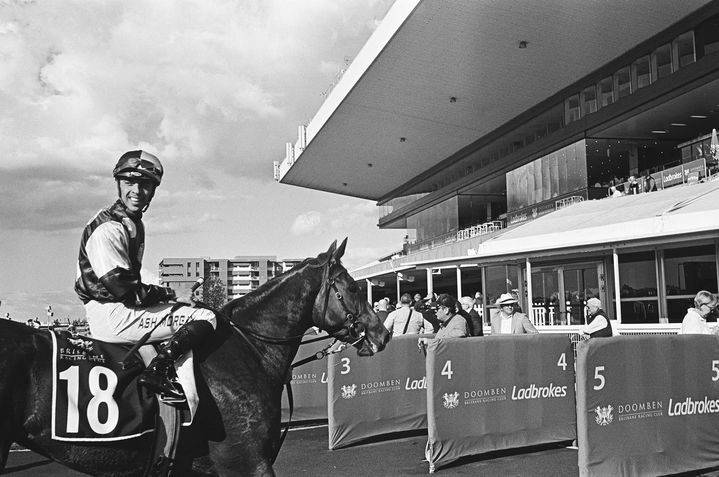
Stradbroke season.From campaign creative direction, to marketing the event, and finally bringing it to life through signage and merchandise, I was involved in every step to create an enriching experience for patrons.
Queensland’s annual premier racing carnival with 7 weeks of racedays and social events.

In addition to the overarching creative, I also designed visual identities for social functions and competitions held within the 7 weeks. These each had their own unique look, while also aligning with the carnival design.